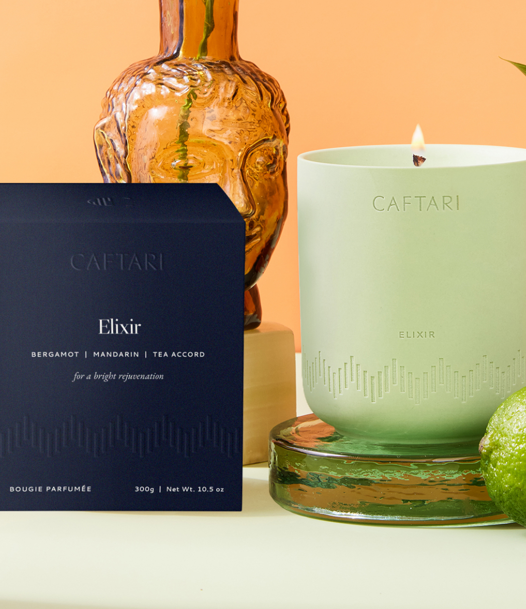
BTS of Our Award-Winning Candle Packaging Design for Caftari
What does it take to create eye-catching, luxury, ✨ award-winning ✨ product packaging? If you’re a new founder who’s daydreaming of the beautiful boxes or bottles that you want to house your products in, you’ve come to the right place! Last year, we worked with our client, Caftari, to develop their brand identity and luxe candle packaging that ended up winning a Dieline Award. (Oh, and you can now shop their products at Credo Beauty, Berdorf Goodman and Free People) It was a total dream project and is a perfect example of how packaging can make or break your customer experience. So let’s break down the process of how we went from some messy sketches of boxes to the final product.
Step 01: Developing the Brand
Before focusing on packaging, you have to start with the brand identity because it’s the foundation that supports everything else in your customer experience! While working with Caftari, our first step was to develop a strategy behind our design direction, which included:
Identifying the brand values and personality
Narrowing in on who the target customer is and what’s important to them
Uncovering the deeper story we want to tell as a brand
Analyzing competitors and industry trends
From there, we used that strategy to start creating the logo, patterns and color palettes that would make up the brand identity. Our main focus with the design was to merge science and style in a clever way because Caftari’s candles use neuroscientist-backed fragrances to balance your cortisol levels. Our solution for this was to create a simple, but sophisticated set of logos and a custom brainwave pattern for each fragrance that represents how the scent influences our neurochemistry.
Step 02: Initial Packaging Concepts and Choosing Materials
Next, we began evaluating our options were for the candle vessels. Our initial packaging design concepts explored whether we wanted to use a label on the vessels or engraving everything into the vessel itself for a more subtle look. And for the box, we knew that we wanted to incorporate the brainwave pattern on those in a fun way. We envisioned having the brainwave pattern wrap around the box and serve as a clever way to communicate how each candle is meant to make the customer feel.
After a few rounds of refinements, we decided that the engraved vessel had that sophisticated and calming aesthetic that we wanted to achieve, so our next step was to send our ideas to the manufacturer and receive a sample to see how it would look.
Spoiler alert: the first round of samples looked terrible 🙈
We were using a ceramic vessel and the technique that the manufacturer tried to imprint the brainwave pattern and candle name into the clay just didn’t work. The lines weren’t clean and crisp like we wanted, so the manufacturer suggested trying out laser engraving instead, which turned out to be perfect!
Pro Tip: Not every idea will work out exactly the way you plan. That’s why ordering samples is SO important! And if you run into an issue like this, don’t hesitate to ask your manufacturer for their suggestion on how to solve the problem. You never know, there might be another way to accomplish exactly what you want.
Once we had the vessels figured out, we moved on to the box that they come in. Although initially we had planned to do a different color box for each candle, we changed directions to only use 1 signature color (a dark navy). This choice was made because we wanted the boxes to quickly become recognizable on a crowded shelf. By sticking with 1 signature color, customers will get used to seeing that color box and knowing it’s Caftari. Especially since during our competitor analysis, we noticed than many of Caftari’s competitors were using white boxes and a dark blue would instantly stand out among them.
We kept the vibes consistent from the vessel to the box, continuing the textural brainwave pattern around the box and even incorporating a custom cutout molecule shape on the back so the customer can take a peek at what’s inside.
Step 03: The Final Packaging
After months of work and waiting on the manufacturer, we finally got to see the finished packaging irl and it was everything we could have hoped for! Luxury. Detailed. Stylish. And a clear connection to their science-backed scents.
We’re so proud of this project and how beautifully the concept came together in the end. And even more proud that it was recognized by winning a Dieline Award for their “Best of Packaging 2024” competition!
So if you’re hoping to creating packaging like this for your own ecommerce business, here are our top tips to make it happen:
Lean into your unique brand story and values rather than what’s trendy.
Don’t be afraid to push the boundaries! Fancy packaging treatments like engraving, gold foil and embossments can have a huge impact at setting your product apart as a luxury item.
You don’t have to figure it out alone. Working with an experienced design studio (like us 👋🏼) can help you make smarter decisions around your packaging! Like finding creative solutions to problems and coming up with a look that’s high-end, but still aligns with your budget.
Want more packaging inspiration and advice? We have other blog posts that you might find helpful, like “How to Save Money on Your Product Packaging” and “Our 4 Fav Resources for Custom Packaging”.


