BeautyGARDE

Nail care without the damage.
BeautyGARDE is a clean nail care company that uses plant-powered ingredients to not only add color, but nourish and strengthen your nails. After spending years building a loyal customer base, their team knew it was time to invest in a rebrand! With an elevated visual identity and packaging experience, they felt prepared to make big business moves like pitching their products to national retailers and expanding their reach.
Services:
Brand IdentityProduct PackagingShopify WebsiteSocial Media GraphicsEmail Marketing Graphics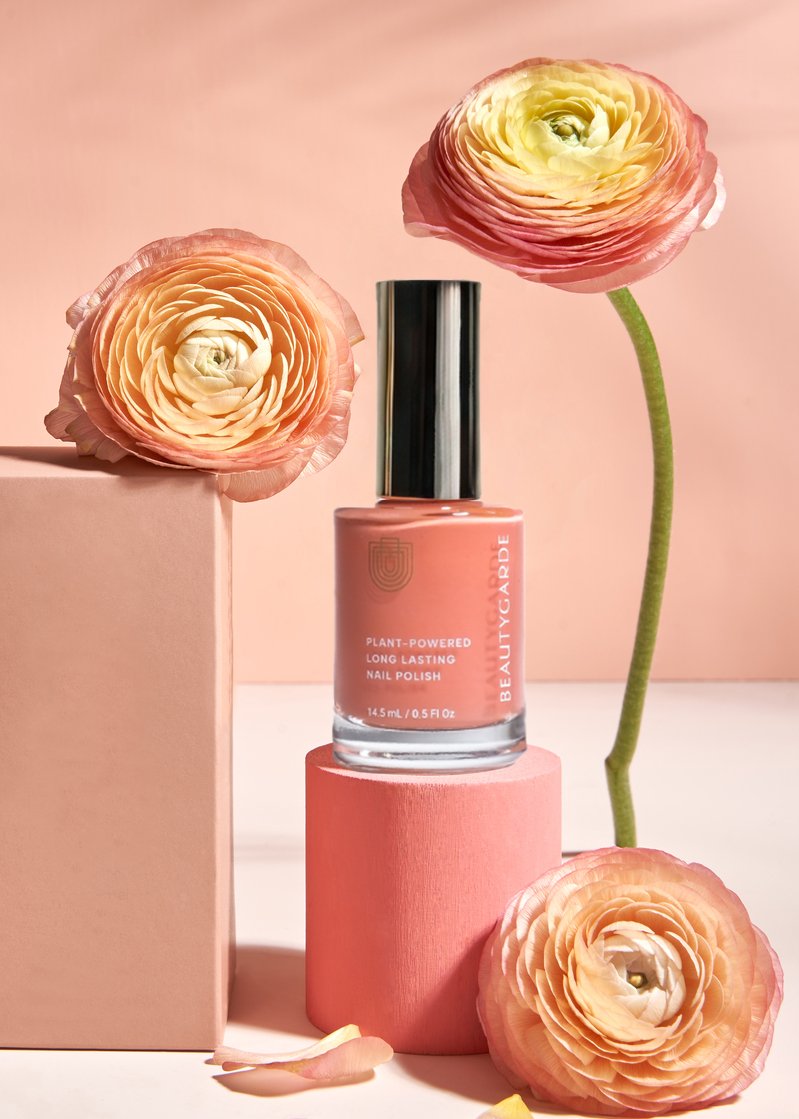

Behind the Brand
BeautyGARDE had already a lot of things right with their company – they had a successful product line, glowing reviews from customers and some big press features. But after years of growing the brand, they were ready to take the company to the next level by pitching their products to larger retailers and refining their look to stand out on a crowded shelf. There are plenty of other clean nail polish brands out there, but few are as clean as BeautyGARDE or have the amazing results that they do. The key difference between BeautyGARDE and their competitors was an elevated and memorable look.
So our main focus was to use a rebrand to make the brand clearly communicate their unique selling points and position BeautyGARDE as a trustworthy, high-quality nailcare brand.
One of the reasons BeautyGARDE customers rave about their products is because of the noticeable difference that their plant-powered ingredients have on their overall nail health. While salon manicures can often leave your nails looking yellow and feeling brittle or weak, BeautyGARDE polishes and nail treatments are formulated to actually nourish, repair and strengthen your natural nails. Resulting in a smoother, longer lasting color finish on top. So our question became this – how can we communicate these results through design?
Our solution was to create a logo and brand pattern that illustrates this idea of deep nourishment and layers of protection for your nails. This felt like a perfect way to:
Reference the benefits of their products
Make the branding more memorable with a simple and easy to recognize icon / pattern.
Separate the brand from competitors (because many other brands don’t use any kind of illustrative mark in their branding).

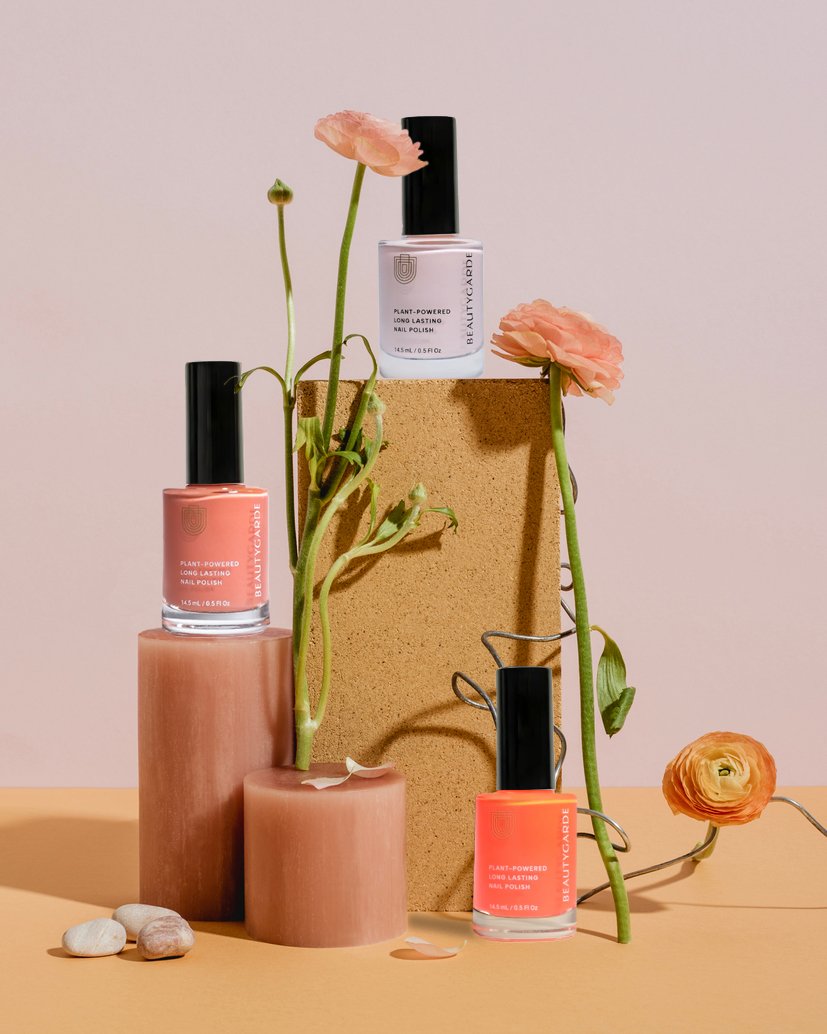
We also did a full redesign of BeautyGARDE’s product packaging. With this part of the project, our focus was to create a layout on their polish bottles that drew attention to the product name + benefits, but in a very clean and sophisticated style. While also making the memorable layered icon logo a consistent detail that customers will easily recognize.
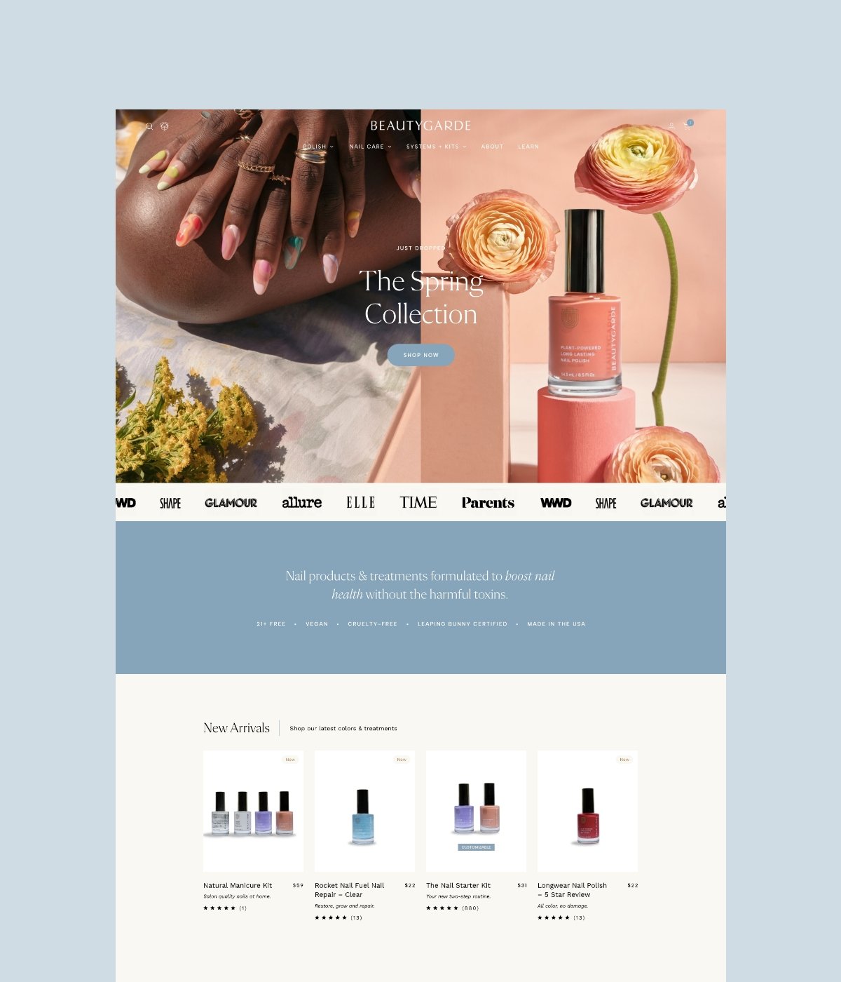
Taking the Experience Online
After the packaging was complete, we moved on to bring the new BeautyGARDE experience to the digital space on Shopify. We used the Combine theme as a starting point and added custom code to build a website that felt friendly and exciting. A big focus for the new website was to make their big product range easy to shop through and navigate. Especially for customers who want to search by color, nail benefits or people who would like to see some examples of the colors in action. So we focused on using design and animated elements to make each page not just beautiful, but also strategic for customers. These are a few of our favorite details of the site:
dropdown polish menu with cute little color swatches
highlighted customer ratings + reviews scattered throughout the site to quickly build trust with new customers
integrating video content with both how-to videos and UGC