A Heartfelt Rebrand for a Jewelry Designer
Are you questioning if now is the right time to rebrand your business? We’ll be honest – rebrands are tough! They bring up a lot of emotions around letting go of the old and embracing change. But as difficult as that all can be, sometimes change is exactly what you need as a founder to find a renewed sense of confidence and clarity in your business. And that’s exactly why our amazing client, Rebekah J, came to us this year to rebrand her jewelry business!
So today, we’re sharing a step-by-step walkthrough of how our project started with Rebekah and the beautiful, purpose-filled brand identity that we ended up creating with her.
Our (Re)Brand Design Process for Rebekah J
When Rebekah first came to us, she already had a lot of things working for her! She'd been in business for a while and had built a loyal customer base, but her DIY branding just didn't feel right anymore. She actually had a background in graphic design too, so it made perfect sense to create her own branding in the beginning. But as she transitioned into doing jewelry full-time, she realized that her branding didn't really match her vision for the future of the business. It seemed like the right time for a rebrand and we're so grateful that she trusted us with this big task!
Rebekah’s old branding
Step 01 / Brand Audit
Our first step was to analyze her current branding, pinpoint what was working, what wasn't, and then go through our creative direction process where we dive into all the things that every founder needs to think about in the beginning! Your brand values, personality, target customer, competitors. Here's what we uncovered for Rebekah:
We loved that she was playing with movement and hand drawn shapes in her old logos to reference the shapes often found in her pieces. BUT we felt like they were a bit too rough. We wanted her new branding to feel more polished and sophisticated to communicate the price point and quality of her jewelry.
Jewelry is a CROWDED space. There are so many small brands out there, so we really needed to figure out what elements of Rebekah's work and approach to business we should highlight to make her stand out. As well as identifying any common trends among her competitors. Like everyone using a similar shades in their brand color palettes or similar styles of fonts for their logos. For example, one trend that we discovered was that many jewelry brands would use a very thin/light, feminine feeling font for their logos. This is typically done to make the brand feel dainty and precious like their jewelry. While this direction might make sense for some jewelry brands, we needed to ask ourselves if following this trend made sense for Rebekah. OR would it made more sense to do things differently in order to help her stand out?
Step 02 / Our Brand Direction for Rebekah J
While strategizing on the creative direction for Rebekah, we determined that a few things would be our main focuses for the design:
BOLD, not dainty. This felt like a very clear and immediate way we could help Rebekah differentiate her brand from other jewelers. Many fine jewelry brands try to come across as precious and dainty, using thin fonts in their logos and little sparkle icons. But Rebekah's work isn't like that. It has a presence and weight to it. The curves are imperfect and inspired by natural elements. So we instantly knew that was something we needed to come across in the branding.
Finding a balance of both structural and organic forms. These were words that Rebekah used to describe her own work during one of our calls and we quickly latched on to that! We wanted to capture that contrast somehow in the logo typography.
A brand that feels familiar, but better. With rebrands, we don't want to create something so new that it's completely unrecognizable to the customers who have followed the brand for years. So with Rebekah, we wanted to make sure that our new branding honored her old look in some way and felt familiar to her customers.
With these ideas as our guides, we dove into the design phase ⤵
Our Initial Concepts
For our first round of brand concepts, we focused on figuring out what font weight felt heavy enough and finding the right combination of adding curves to certain letters.
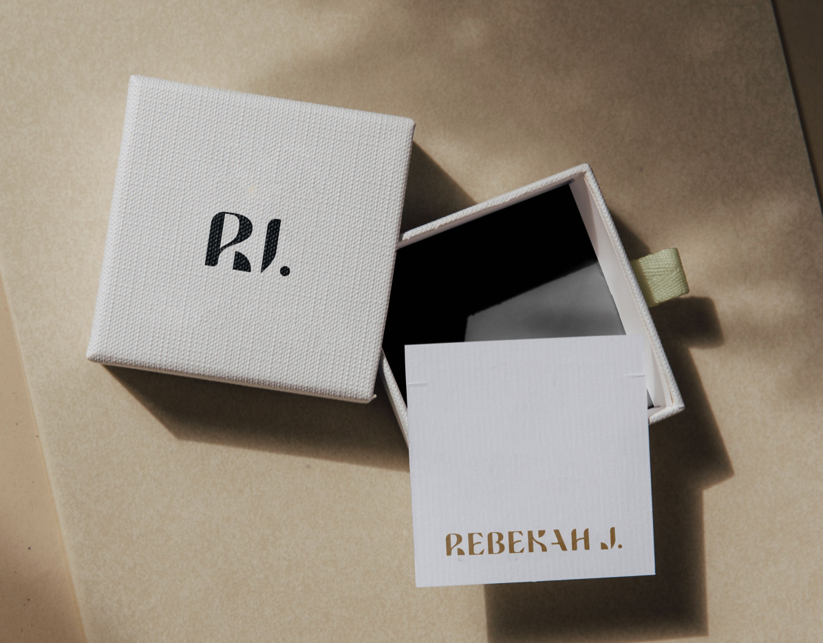
The bolder concept definitely felt better to us, so we moved on to the next round of refinements to play around more with custom letterforms, testing out color palette ideas and packaging applications.
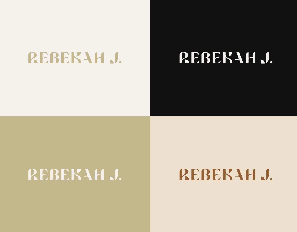
Top Row: Concept 03, Bottom Row: Concept 04
Concept 03 focused more on mixing sharp/structural angles with smooth, organic curves inside in the letterforms. While Concept 04 focused more on lots of curves and negative space, as well as incorporating some shapes to create parts of the R, K and J letters.
In the end, we liked different aspects of both concepts so we decided to try and merge them together. (Which tbh doesn't always work well, but in this case it did)
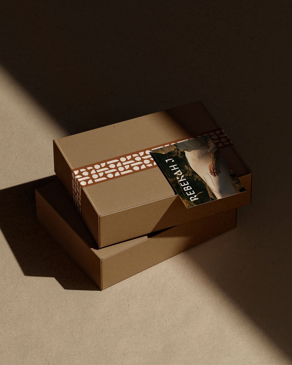
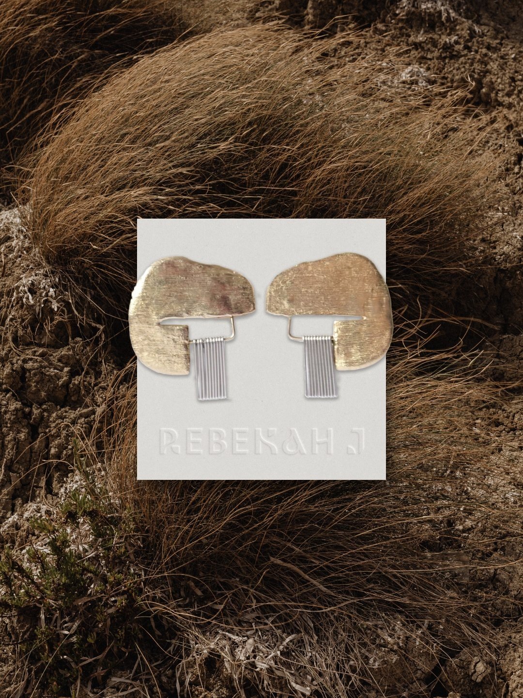
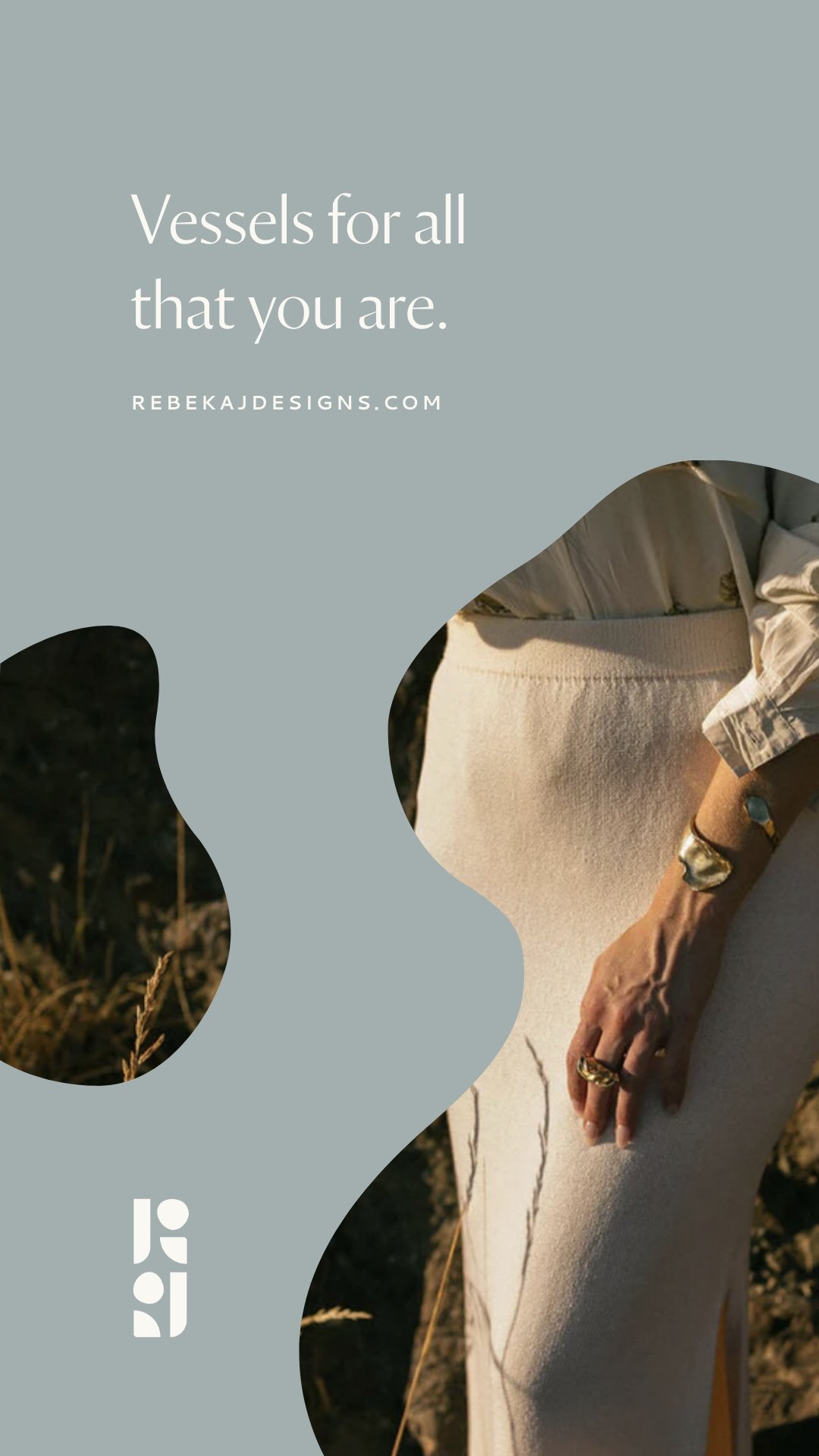
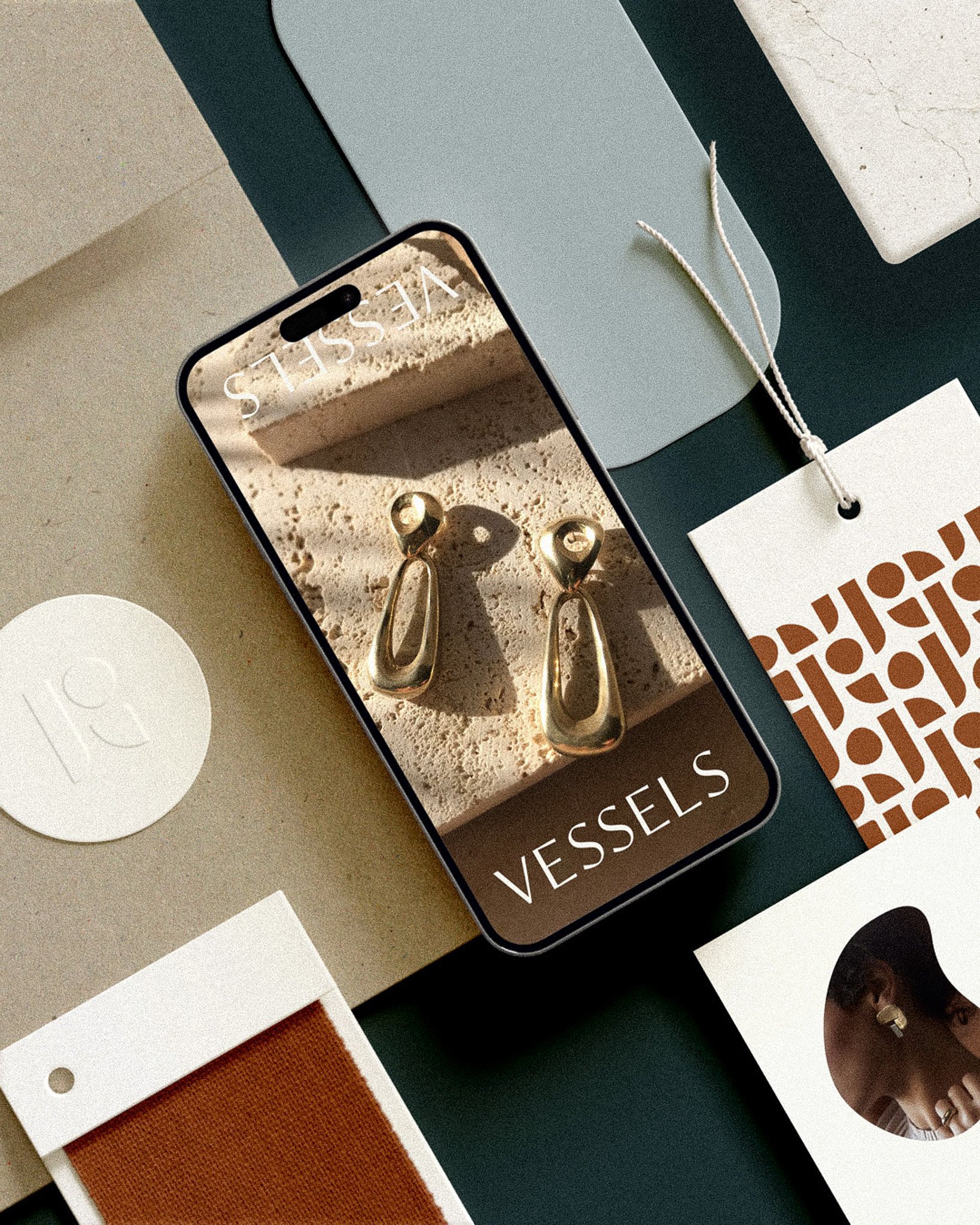
Rebekah J’s Final Brand
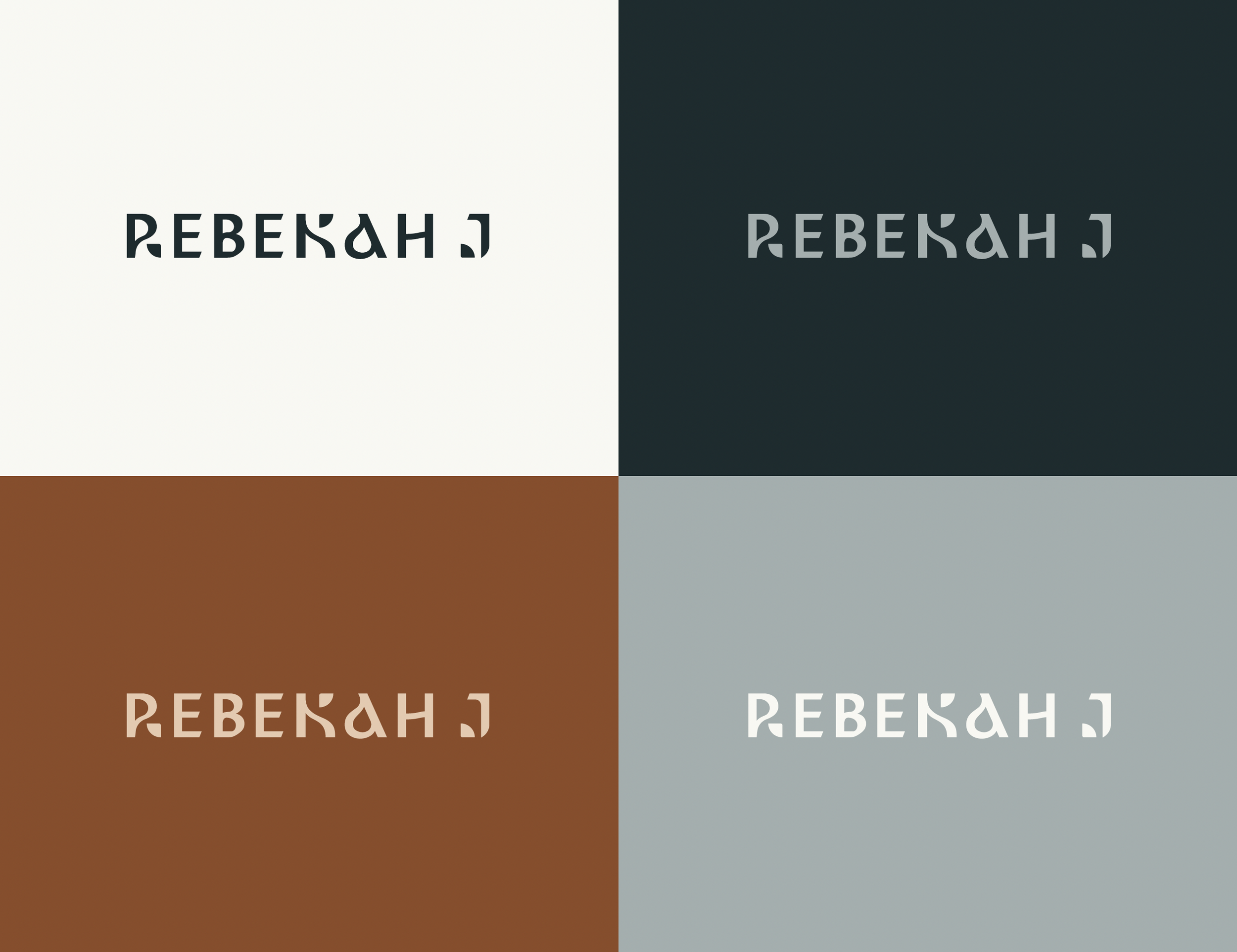
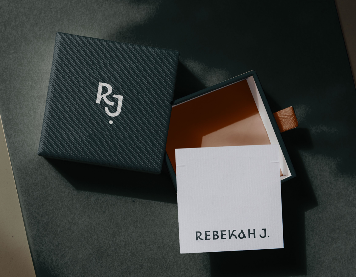
It took a lot of work and refining, but we finally uncovered exactly where we were always meant to end up! The final logo is creative, but also balanced. Bold, but still refined. It compliments Rebekah's work so well and as she put it, “feels like a grown up version of Rebekah J”.
We hope you enjoyed this breakdown of what it really looks like to go through a rebrand and make sure to go check out Rebekah J on Instagram! She's been sharing so much great content about the rebrand like how she's updating her packaging (and still making use of the old packaging too)
If you're in need of a rebrand too, we'd love to chat! Check out our Pricing + Offerings Guide or reach out to work with us before the end of the year.


