Designing a Playful + Sophisticated Brand Identity for Minimal Mae
Developing a brand that blends in is easy. But developing a brand that truly stands out is what we live for. And that’s exactly what we did when we worked with Casia and Eric of Minimal Mae, who just opened their brick and mortar kids shop in Tucson, Arizona this summer!
So let’s take you a step-by-step through how we designed the Minimal Mae brand to balance playfulness and a simple, sophisticated style all at once.
Our Design Process for Minimal Mae
When Casia and Eric first came to us, they had high expectations for how design was going to set their shop apart. They practice a minimalism in their everyday life and are big believers in quality over quantity. So when it came to their branding, they had a few requests. It had to be simple, but memorable. Playful without being childish. And meaningful, really capturing their deeper “why” as minimalists.
Building block inspiration
Step 01 / Brand Roadmap
Our first (and favorite) step of the branding process is to dive into the client’s brand values, personality, target customer, competitors. Here's what we uncovered for Minimal Mae:
Many kids boutiques used similar branding details like pastel color palettes, script fonts and hand drawn illustrations. To be honest, a lot of them look a little childish. Which, in theory, makes sense for a children’s shop. BUT the child isn’t actually the customer, the parent is! So our plan was to break away from these trendy choices and aim for a brand identity that felt playful without feeling childish. We wanted to create something that felt more elevated for the parents to resonate with, but still feel enjoyable for kids.
Minimalism is the heart of what Casia and Eric do. Their shop was going to be filled with simple staples that encouraged families to buy less things for their kids and invest in higher quality, responsibly made products. But that alone didn’t feel like a super compelling story to tell. So we dug deeper and asked the question, “What’s the real benefit of living a more minimalist life as a family?” The answer we landed on really hit home for everyone – less stuff and clutter means more time and space for the things that really matter. For example, if you have a more minimal capsule wardrobe for your kid, it will be easier to get them dressed in the morning and therefore, open up more time to eat breakfast together as a family. That’s the deeper story that we felt excited to tell through the brand and new that the customer would resonate with!
Step 02 / Our Brand Direction for Minimal Mae
While strategizing on the creative direction, we determined that a few things would be our main focuses for the design:
Playful, but sophisticated. This felt like a very clear and immediate way we could set Minimal Mae apart from their competitors that lean more into the earthy, hand drawn, Pinterest-y branding that’s been done again and again.
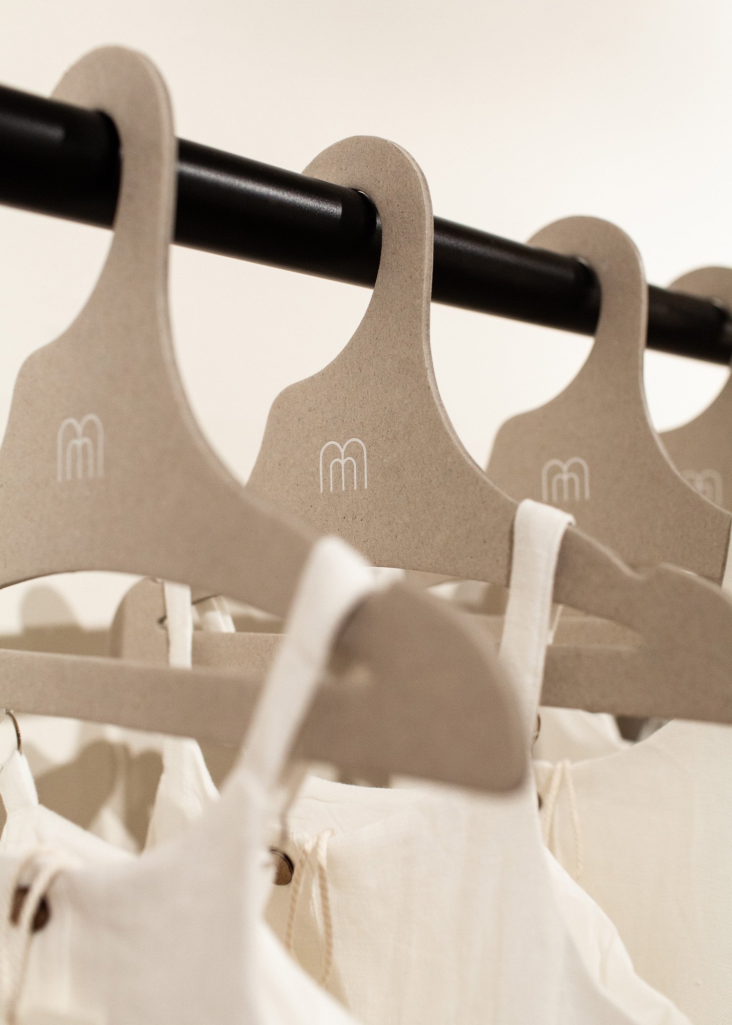
Pulling inspiration from building blocks. These are such simple toy that feels familiar to both parents and kids. It seemed like a perfect illustrative detail to use throughout the branding to add some of that playful vibe, but do it in a super modern, geometric style (not childish). It was also a nice nod to Eric’s background as an architect, serving as a more personal touch for the client.
With these ideas as our guides, we dove into the design phase ⤵
Our Initial Concepts
For our first round of brand concepts, we focused on finding the right style of simple, sans-serif font and where to incorporate some playful geometric shapes within the letterforms. We also explored different combinations of uppercase and lowercase letters, trying to create an overall logo that felt confident and welcoming at the same time. And for the secondary logo, we tried out two different styles of building block illustrations to see which one felt just right.
Concept 1 with the curved “M” and slide-inspired “a” felt the best for everyone, so we moved forward with that went on to explore some refinements of the building block icon and color palette ideas.
Minimal Mae’s Final Brand
In the end, we landed on our final concept that captures everything we’d hoped for:
A logo that brings together simplicity and playfulness without feeling childish
Using building blocks as a symbol throughout the entire brand to make it fun for kids, nostalgic for parents and connect with the co-founder’s background in architecture
A desert-inspired color palette that’s warm, welcoming and moves away from the trendy pastel blues and pinks that you often see with kids brands.
The Minimal Mae storefront, photographed by Fletcher & Co.
We hope you enjoyed this breakdown of what it really looks like to go through the branding process with Wayfarer and make sure to go check out Minimal Mae on Instagram or shop in person in Tucson!
If you're in need of branding too, we'd love to chat! Check out our Pricing + Offerings Guide or reach out to work with us before the end of the year.


