How We Branded an Innovative Skincare Company
Do you ever look at a beautiful skincare product on the shelf and think, “I wonder how they came up with that logo and chose the colors for their packaging”?
Now, be extra honest with us: how many times have you chosen a skincare product because of its beautiful packaging, logo, color scheme, or design?
There’s nothing better than an aesthetic skincare brand; its products pop off the shelf in store, and tend to also serve as a beautiful focal point on your vanity. Believe it or not, getting to that just-right blend of aesthetically pleasing, yet still functional and effective brand design for skincare brands is a challenge. A worthy one, at that!
We’re here to take you behind the scenes of our design process for BODDI, an exciting new skin and body-care brand that’s doing things differently.
Our Brand Design Process for BODDI: An Innovative Skincare Company
BODDI’s Brand Positioning
When BODDI’s founder, Amanda, first got in touch with us, we were smitten with the mission behind her products. Over the course of the pandemic, Amanda spent time learning about hygiene awareness, and the limitations that millions of people face due to a lack of access to clean water or hygiene products. To help address this pressing issue, Amanda wanted to create a way to shower on the go, without water.
And thus, BODDI was born.
Although there are plenty of other body wipe brands on the market, Amanda found that many of them used ingredients that can be harsh and drying on the skin. So, her challenge was to create a new solution that not only cleansed, but nourished the skin.
After a bit of user testing, Amanda discovered that the standard rectangular wipe wasn’t a very effective design. This led her to test BODDI’s current mitt design, which (obviously) received an overwhelmingly positive response!
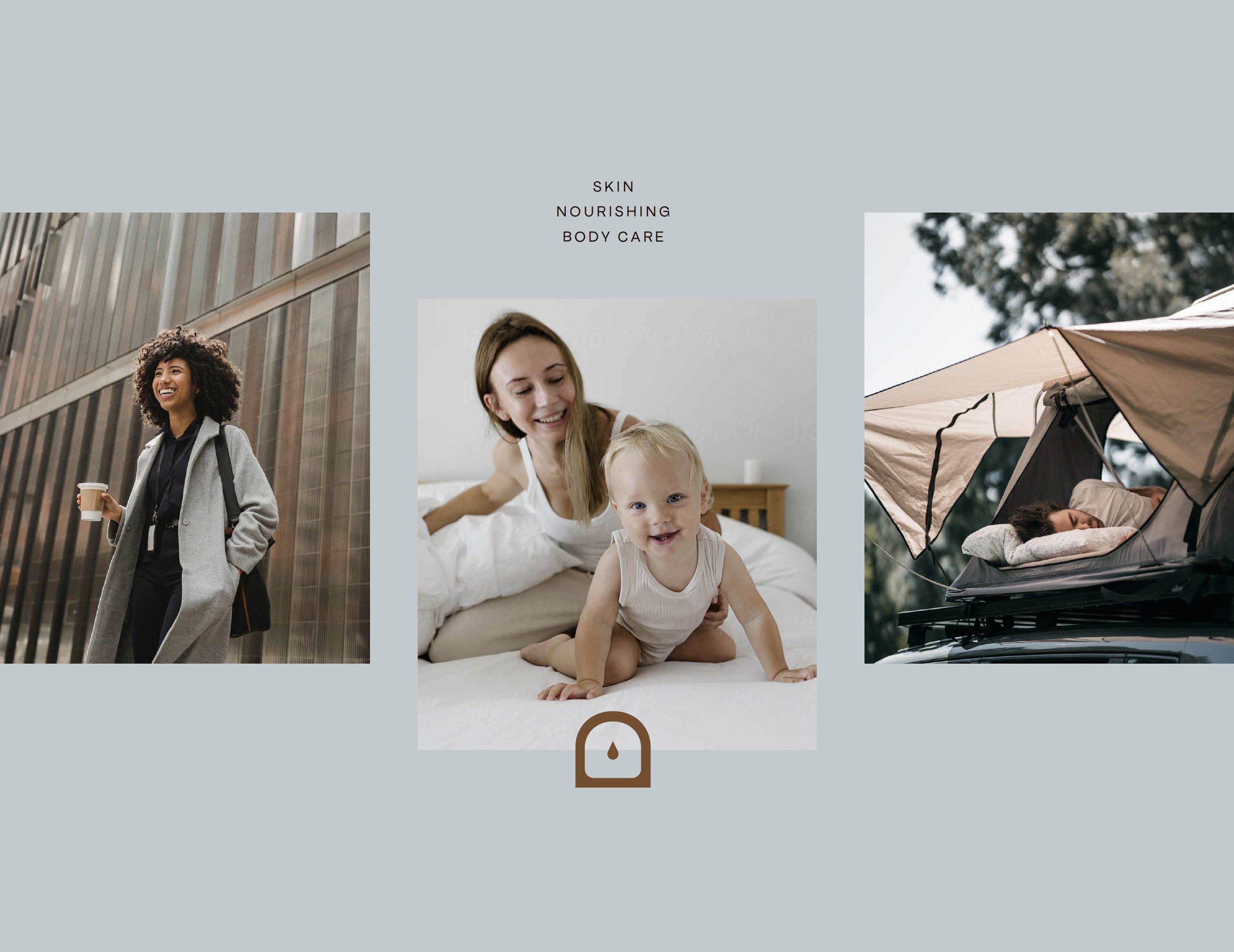
Amanda’s amazing business plan came with a few obstacles. BODDI’s product had the potential to help a wide-ranging audience; anyone who could benefit from a quick and easy way to get clean without access to water. She envisioned her product being used by people who went straight from work to the gym in the mornings, busy moms with limited time, lovers of hiking and the outdoors, or those embracing van life.
With this huge audience, Amanda felt overwhelmed about how to clearly position her brand in a way that would resonate with every audience member, while also reflecting her core values. So, that was our big challenge – develop a brand that highlighted what made BODDI unique, conveyed how the product would impact the customer’s life, while still appealing to a wide audience. A design challenge if we’ve ever seen one!
Our Brand Direction for BODDI
While strategizing on the creative direction for BODDI, we determined that a few things would be our main focuses for the design:
In an industry that tends to lean towards femininity, the design would be unisex and inclusive.
BODDI’s brand personality would be kind, welcoming, and just a bit rebellious. ↪️ Our thought process: What else will you go for after cleaning your body on the go? What amazing things will you accomplish? What joy will you experience? What sights will you see? Feeling clean = feeling capable, and feeling capable = taking action. That was the real reason why we believed our huge audience would feel inclined to purchase BODDI’s product, and why we wanted BODDI’s personality to be kind, welcoming, and rebellious.
We wanted to highlight BODDI’s signature mitt silhouette, as it is a huge differentiator from other brands on the market.
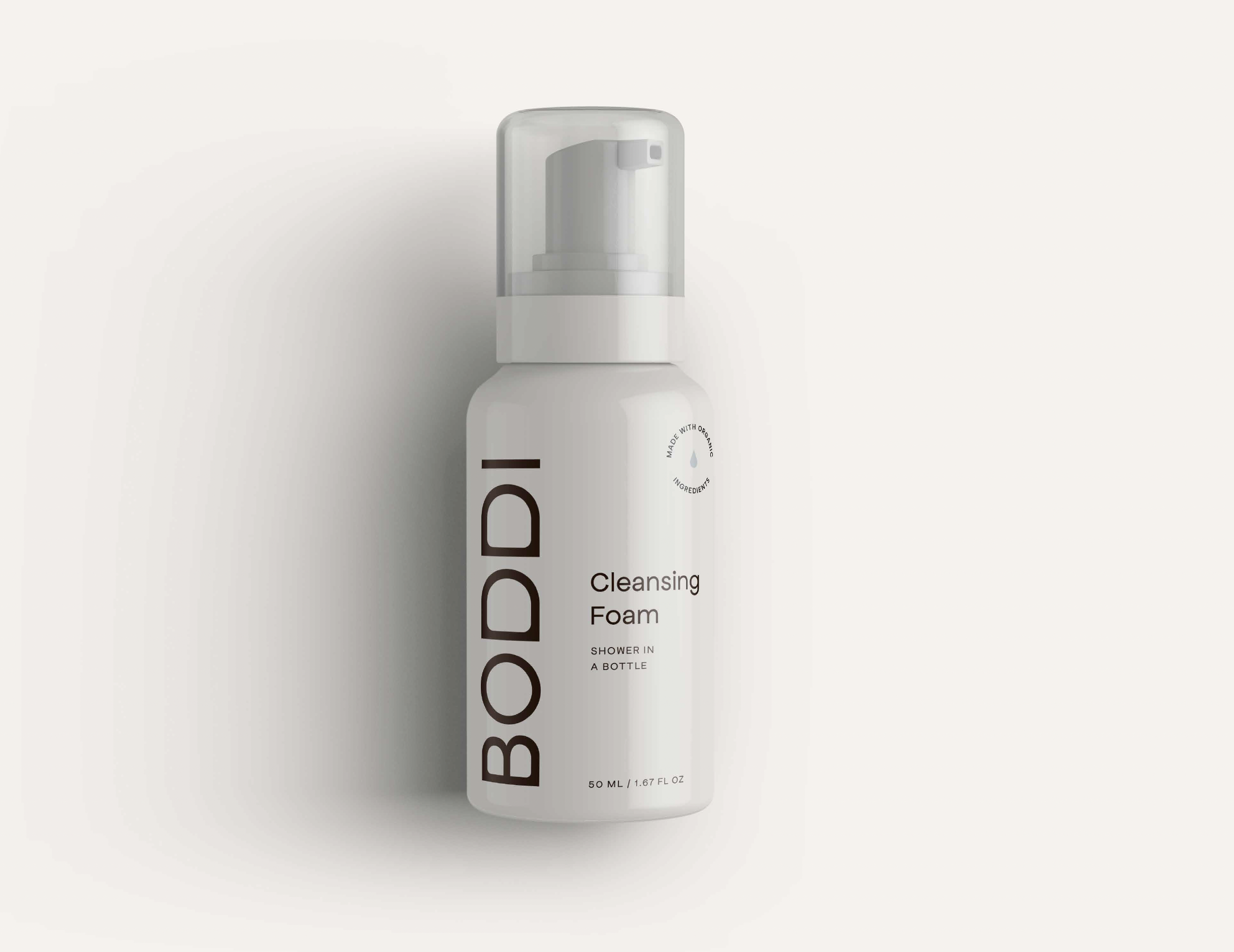
With those main focuses in mind, we envisioned a bold and confident font for the logo, while also incorporating the mitt shape in our typography. Combining those two elements would serve to tie the visual identity with BODDI’s key selling point, and make it more recognizable for customers.
Our Initial Concepts
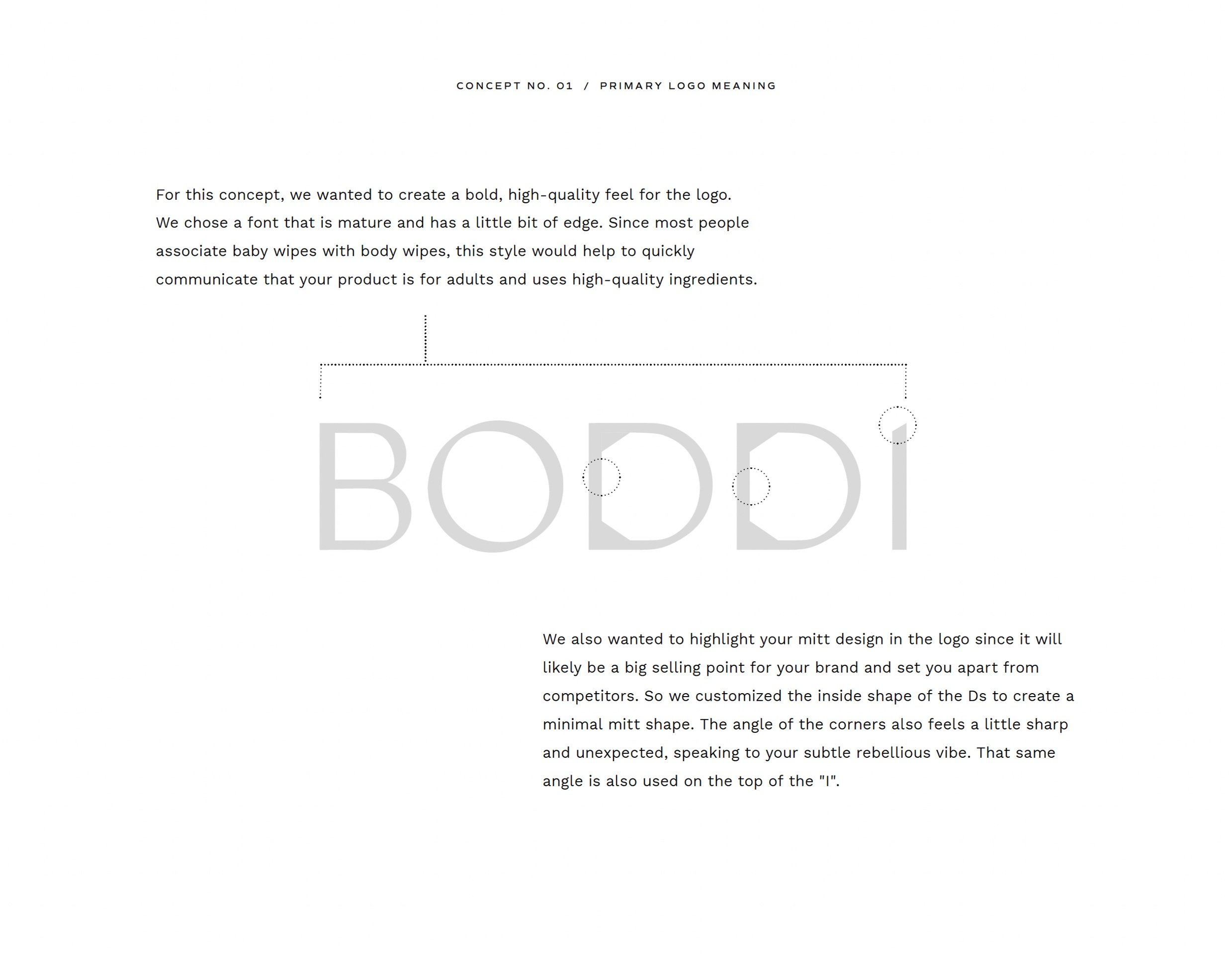
As we got to work on our first round of logo concepts, we experimented with integrating the mitt in BODDI’s logo typography. The D in BODDI proved to be the perfect letter to use, since it was already close to a mitt shape. From there, it was just a matter of finding the right balance and style.
At first, we tried customizing the inner shape of the D to illustrate the mitt with different curves. Our early concepts were close, but needed some work!
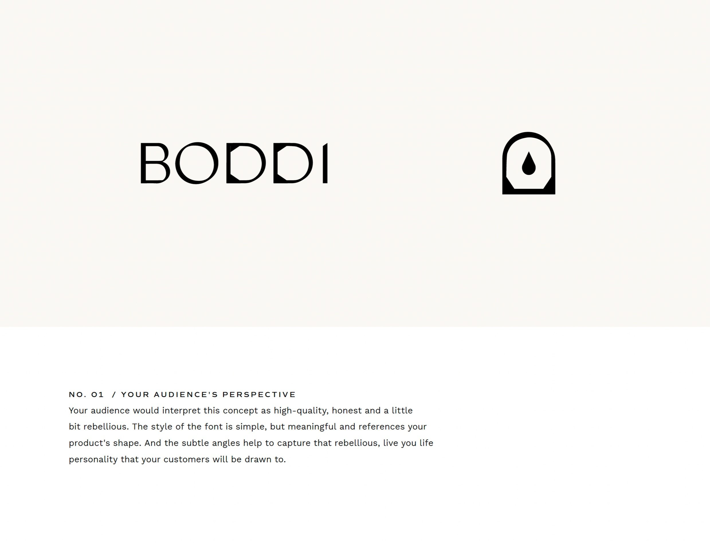
We presented the first concept to Amanda, who also loved that we were tying in BODDI’s signature mitt shape. We showed how the D could be used on its own as a secondary logo, with a water droplet inside to clearly illustrate how BODDI acts as a shower in a mitt.
But that initial font felt a little too sophisticated. (Yes, there’s such a thing!) Amanda wanted to see if we could make things feel a bit more modern and friendly. So, we made some adjustments before landing on the final logo design that captured everything we wanted.
BODDI’s Final Brand
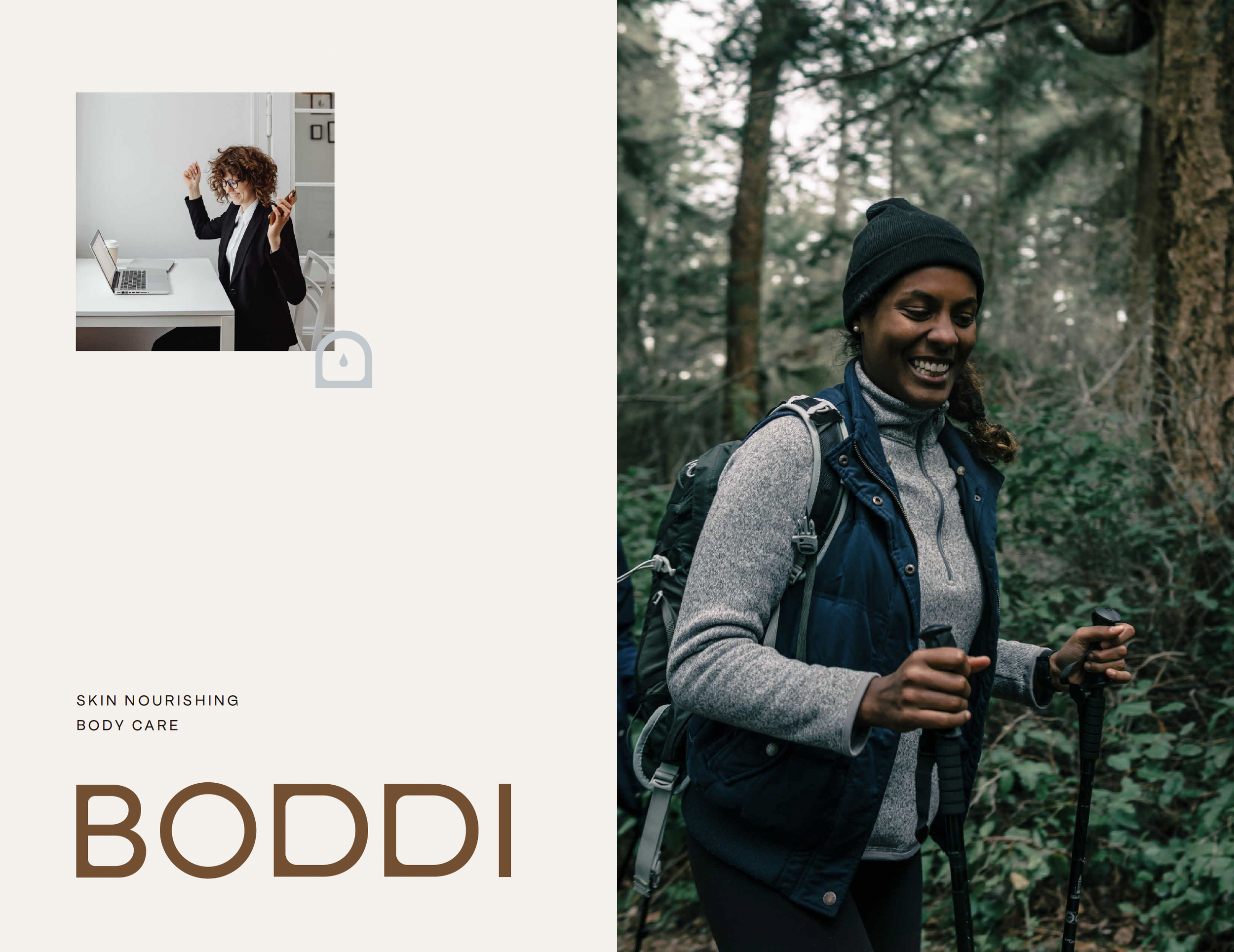
After switching to a bolder sans-serif font, BODDI’s branding achieved that unisex feel that suits a broader audience. To balance out that boldness, we added curves on the inner corners of the Bs and Ds to soften things up, and make the overall logo feel more welcoming.
Finally, we chose a color palette that communicated our goal of keeping BODDI inclusive yet rebellious. We used warm, skin-inspired tones as the brand’s primary colors, with the option to pair them with more playful colors like earthy green, blue, or yellow to add more life to the brand.
We’re thrilled with how BODDI’s brand came together, if you can’t tell. Its design captures that welcoming, inclusive vibe that BODDI wants to be known for, while also communicating Amanda’s mission: to help everyone feel confident and capable of living the life they want.
Amanda’s thoughts on the project:
“I couldn’t envision what the branding was going to be before I started working with Wayfarer, and now, I can’t imagine it being anything else. It represents the brand incredibly well and balances sophistication and welcomeness all at the same time.”
That could be you, you know. We aren’t ones to toot our own horn, but we know a thing or two about bringing brands to life through thoughtful, heart-led design. Want to work with us?
Good, we hoped so.


