BTS of Our Website Redesign
If you’re a designer, you’ll understand the next few words on a biological level: redesigning your own website is the worst. Truly, it is the worst.
We have a theory as to why: as designers, we are never fully satisfied with our own websites. There will always be sections we want to add, tweaks we *believe* need to be made, and maybes and must haves that pop up at any given time. If we’re perfectly honest, we believe that every designer is just 1 second away from completely redesigning their entire website at any given time. It’s just how we are?! [We say both quizzically and emphatically.]
Last month, we underwent a massive relaunch of our Wayfarer website. It was such a relief to finally have the new site live and out in the world! 6+ months of work and so much thought and love went into it. So, we’d love to take you behind the scenes of our 2022 website redesign by discussing our past websites. Then, we’ll take some time to discuss and review three of our favorite pages from our new site: our Home, Services and For Designers pages!
Wayfarer Websites of the Past
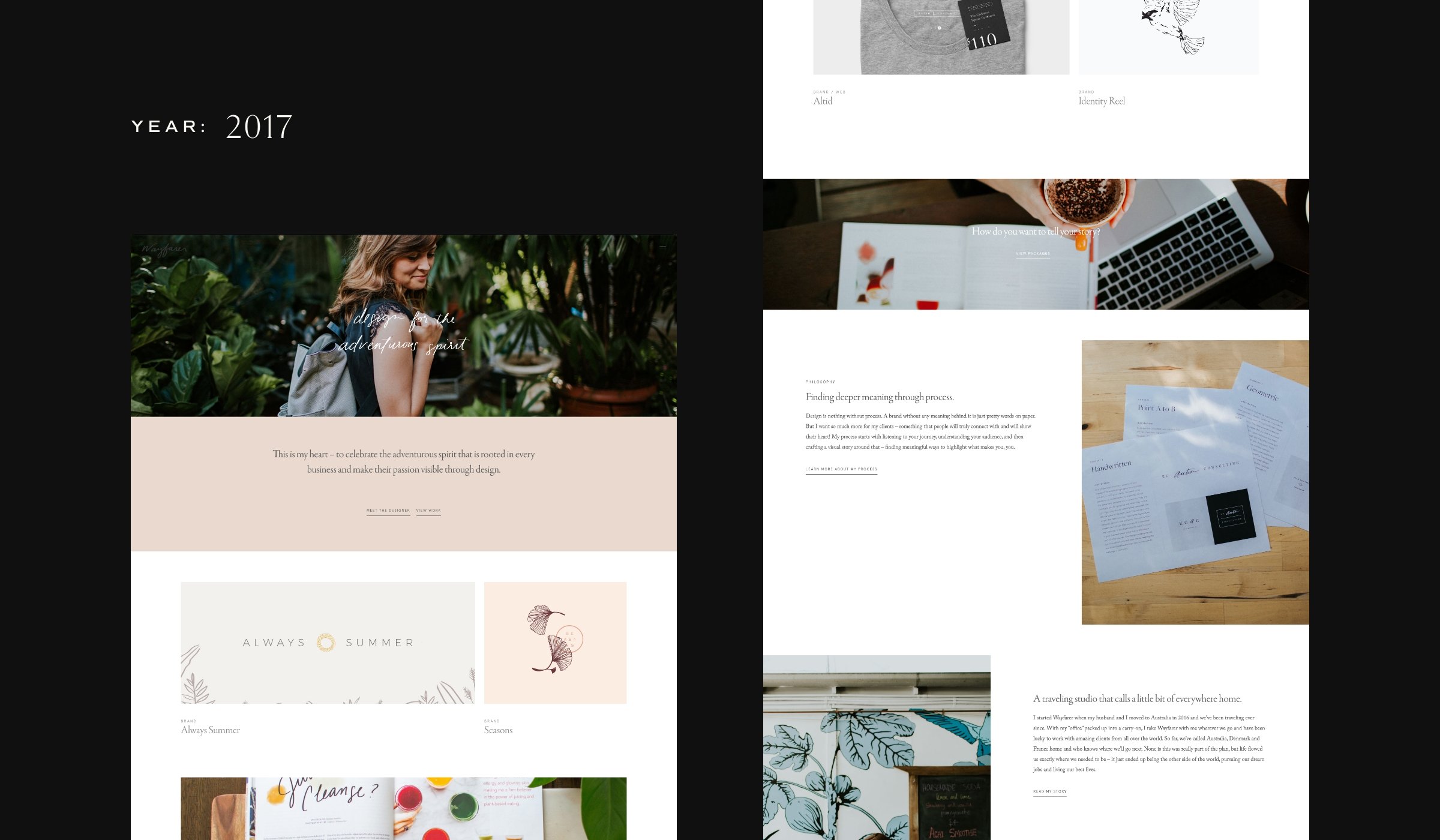
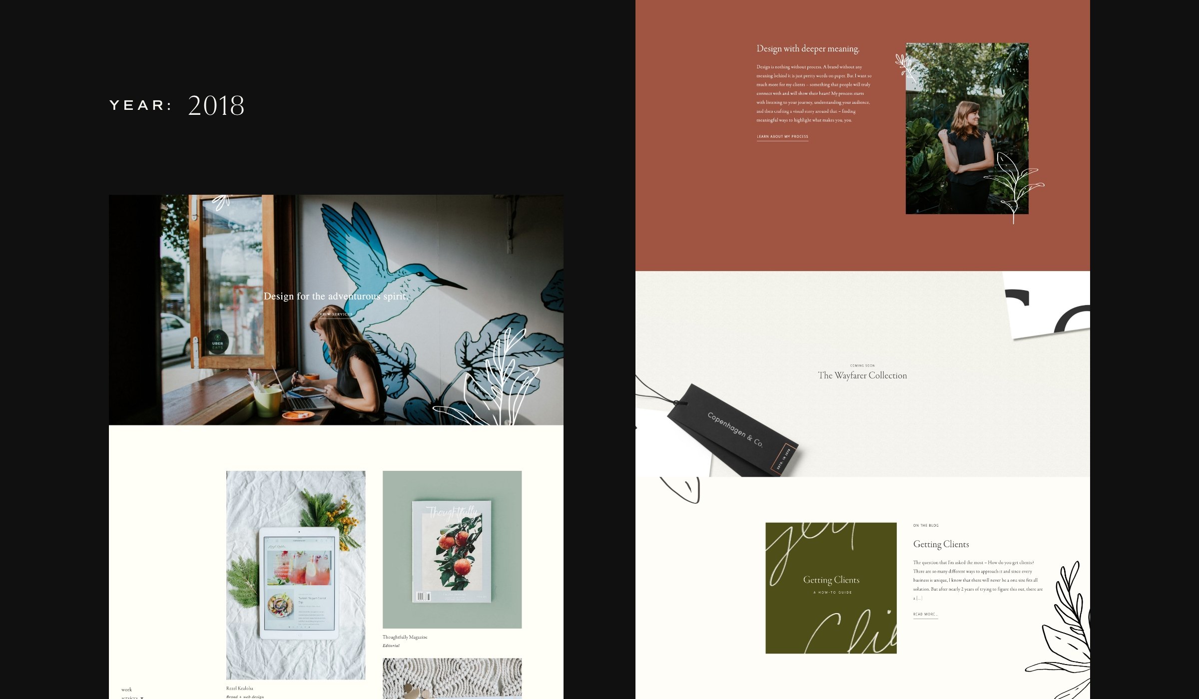
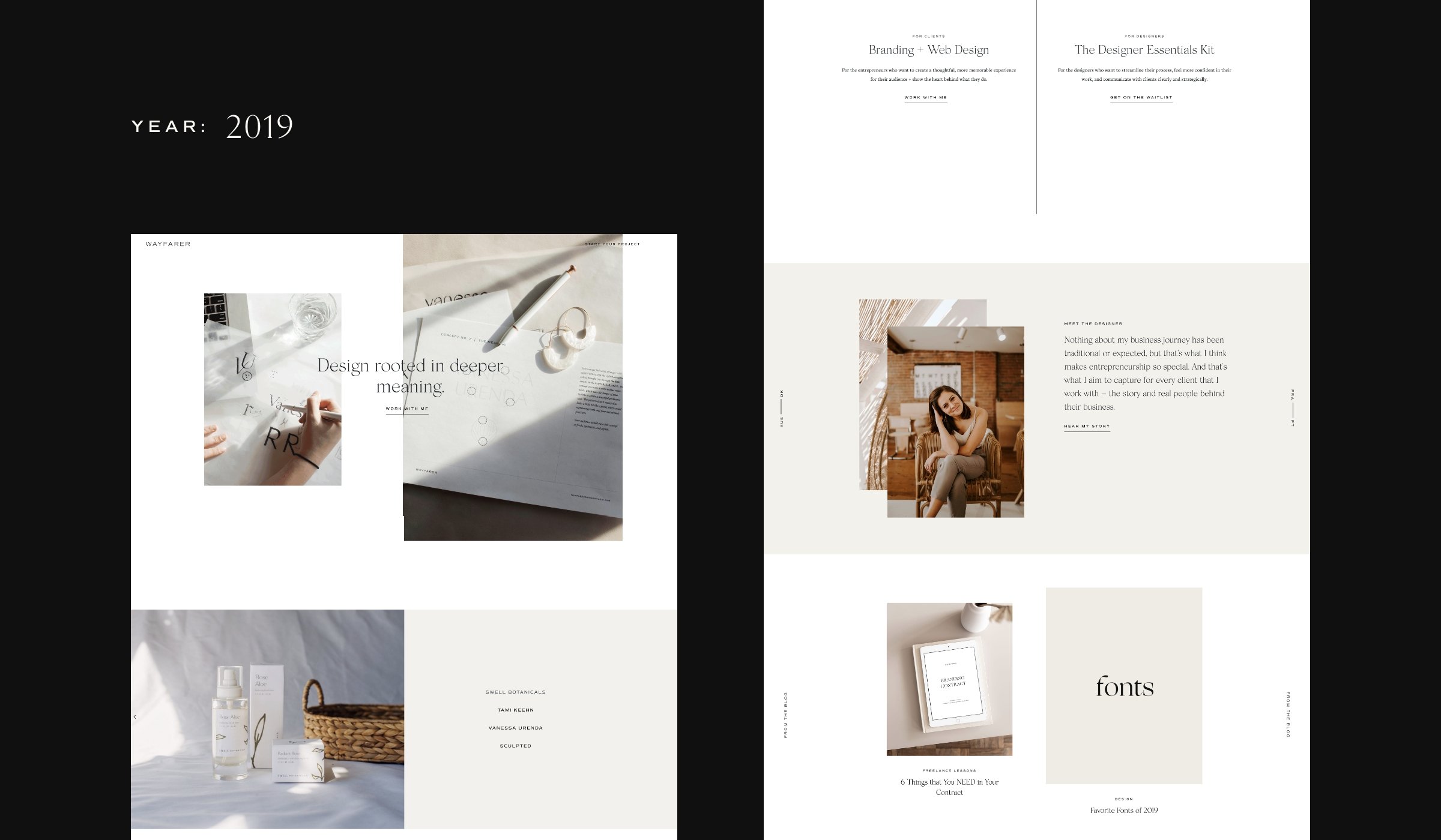
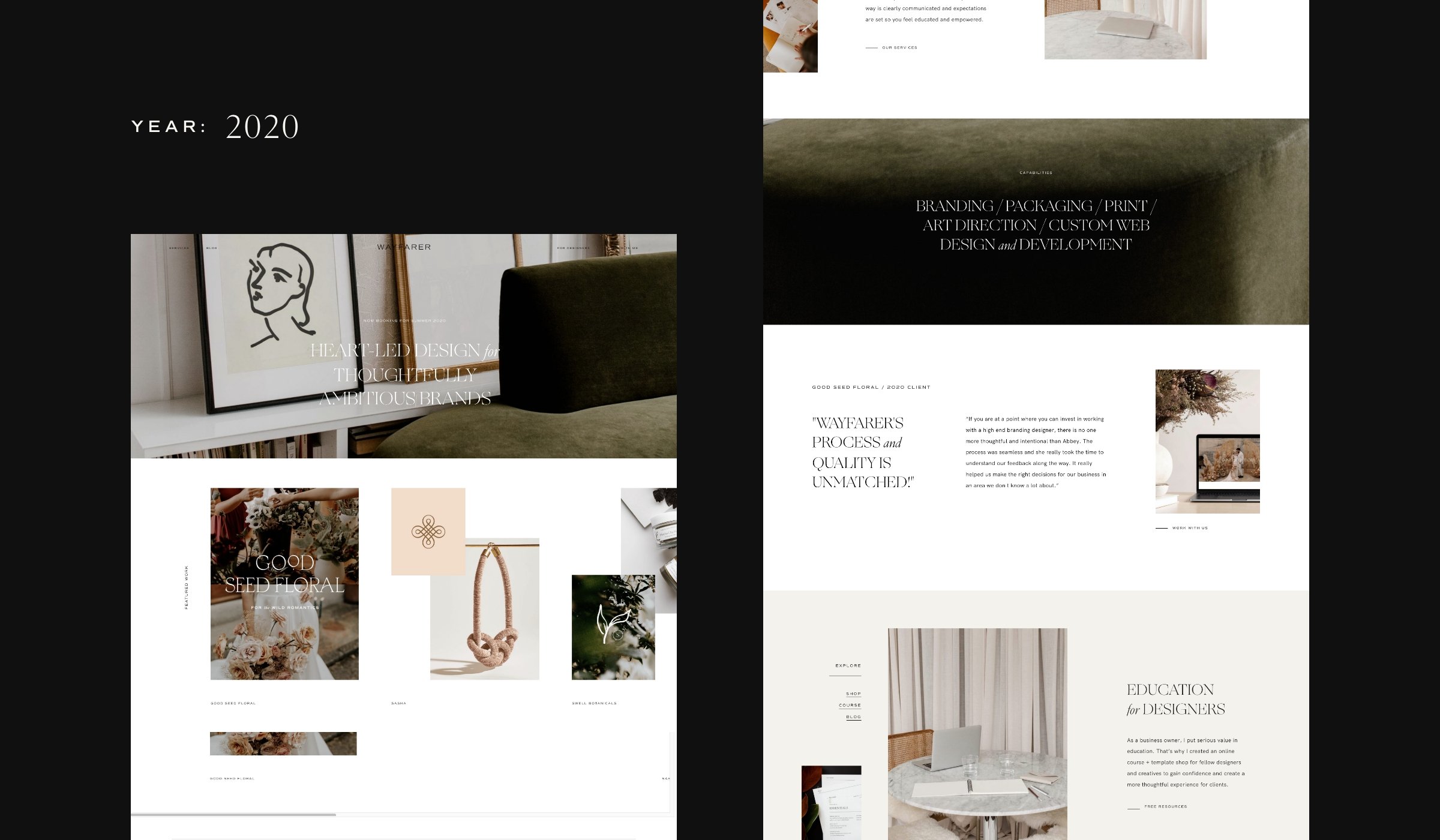
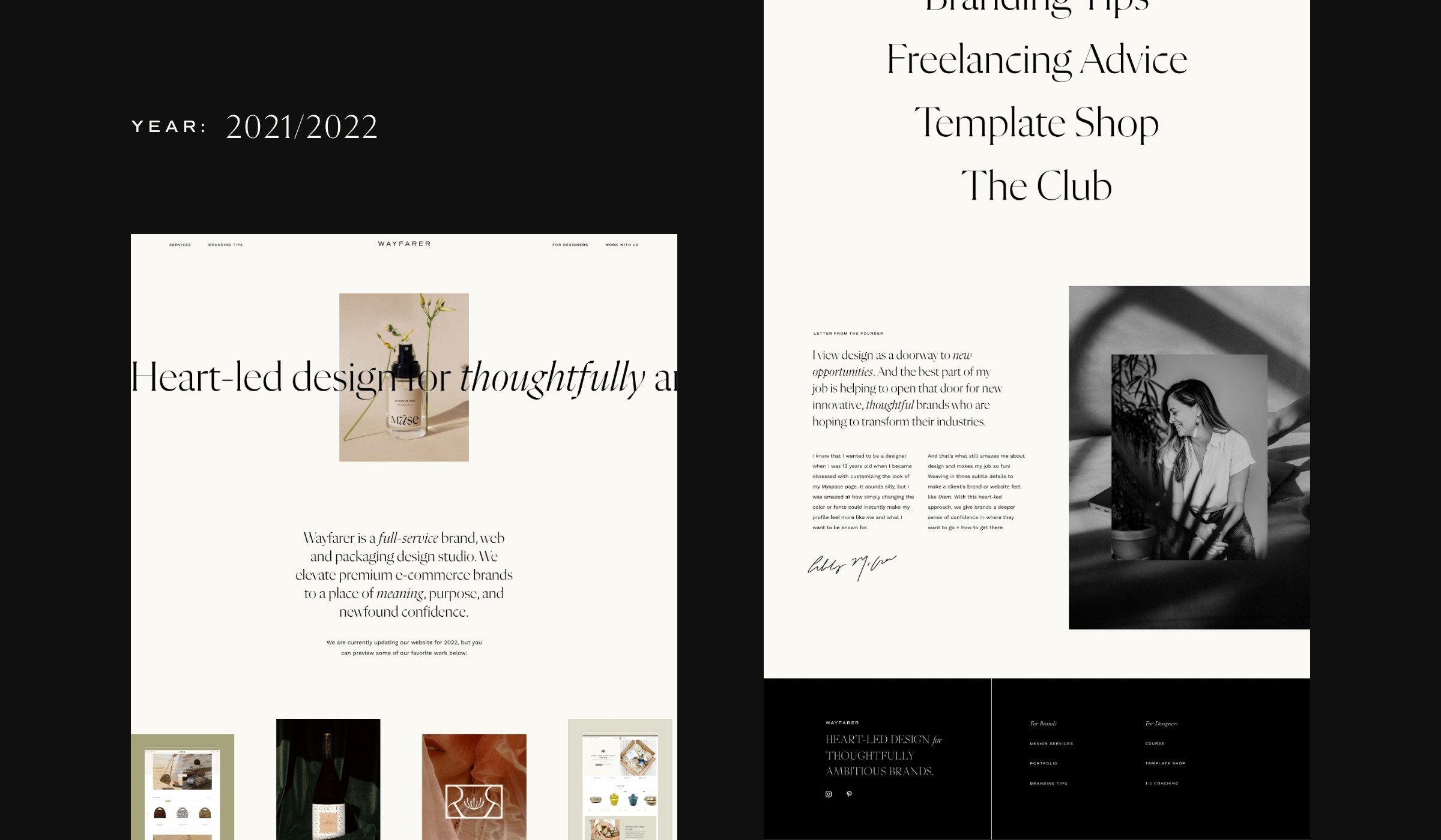
Let’s first take a look at the elder sibling versions of our Wayfarer website, juuust to see how much has changed over the years.
As you can clearly see, Wayfarer’s style and how we present our design business has evolved quite a bit! With our new site, we wanted to do a few things differently:
Embrace a more neutral color palette: Although we love working with a feminine design style, we don’t want to pigeonhole ourselves into being a design agency that only caters to brands with a feminine aesthetic. So, we ditched our previous pink colors that we featured on our older site versions!
Really convey how Wayfarer has grown by sharing information that showcases us as an agency, rather than its previous one-woman show.
Clearly define the types of clients that we want to work with. Rather than just "passionate business owners", (which includes… everybody) we want to work with innovative, thoughtful, product-based brands that want to bring something new to their industry.
Feature a more detailed portfolio on our site, rather than just linking to our IG page 🙈
Create a different feel for the educational side of the business. The pages that feature educational resources for fellow creatives include different fonts and colors, making them feel instantly separate from the more neutral, refined Wayfarer Studio portion of the site.
We dove into our website redesign with those five goals in mind!
After hosting the Wayfarer site through Wordpress for over 6 years, we made the decision to transition to Squarespace. Back in 2016, we were attracted to Wordpress because of its extensive code customization possibilities (Abbey actually coded the first few websites from scratch!). However, several years later, Wordpress’ back-end platform began to feel dated.
As the Wayfarer team grew and more members were available to help update the site, it felt like the perfect time to switch to the much more modern Squarespace! We also happened to selfishly want to work with Amber Ladd, the Squarespace Queen, to develop the site, which may or may not have inspired our overdue transition.
Please allow us to show just a few of our favorite sections of the new Wayfarer site!
A Study of: Our Homepage
Obviously we’re just a bit biased, but our homepage is ✨ gorgeous ✨. Hence the sparkles.
Our homepage opens with a split page slider that showcases some of our BEST work in an effort to give our clients an immediate sense of our style, and what we’re capable of. We also included copy that shares insight into our design approach, as well as the specific services we offer.
But our favorite part of our favorite page? The portfolio section. The imagery is laid out in such a unique way with fun shapes - and when you hover over a project, the color changes to reveal more information.
Next up: Our Services Page
Being a service-based business, it’s safe to say that our services page is extremely important to our success. Our intention with this page’s design was to answer our potential clients’ questions, while also ensuring they have a clear picture of:
Who we want to work with.
What types of services we offer.
How our services can make an impact on their business (beyond just making things look better).
Our trustworthiness through testimonials and explaining our process.
Creating a compelling services page that’s both aesthetically pleasing and context-driven can be a difficult feat. However, we’re happy with the balance we struck! *Not us scrolling through and clicking while murmuring “preeetty.”*
Lastly: Our For Designers Page
Truly, one of the greatest joys of running Wayfarer has been educating fellow creatives and designers! Because of that, we wanted our “For Designers” portion of the site to feel extra exciting and welcoming.
We started our design resources section of the site with a dropdown menu to help designers instantly find resources that would relate to specific problems they face. From there, they can scroll and be introduced to the wide variety of resources we’ve created for designers - from workshops, to checklists and templates.
When searching for information or education, it’s always comforting to feel like everything can be easily found in one place. We wanted to achieve that feel, without losing the aesthetic we love so much. And we’re kind of obsessed!
View our resources for designers
That said, we’re good for the next 6 years. (Maybe)
Yeah, so redesigning your own website? Not easy. But we’re so glad to have our new Wayfarer website out in the world! If you’re currently considering giving your own site a refresh, we hope you’ll use this blog for inspiration.
And of course, if you wanted to work with us? You know we’re here.

