Product Packaging Design Tips for Better Shelf Appeal
So you’ve created an amazing product, but now comes the next big challenge… How do you get customers to actually pick it up off the shelf?? Today, we’re going to break down some of the most important decisions that you’ll need to make when creating your product labels and packaging. Along with some mistakes to avoid that could impact your product’s shelf appeal!
No. 01 / Use Color Strategically
As consumers, we subconsciously associate specific colors with different ideas and emotions. For example, green can instantly make us think that a product uses organic ingredients, impacts health or is environmentally-friendly. There’s a psychology behind color and big brands use it all the time to influence what assumptions people make about their products.
So with your own packaging, you want to make sure that you are using color strategically to communicate whatever you want to say to potential customers. Whether that be about what ingredients you use, what your values are as a brand or simply how you want people to feel after using your product. To learn more about color psychology, we recommend reading this blog post that breaks down the emotions and ideas tied to different colors and give you a fun color palette quiz to take!
No. 02 / Use Intentional Hierarchy
When it comes to packaging design, you might think that layouts and fonts are just about creating a composition that looks good. But there’s more to it than that → Different layouts, font treatments and sizing can actually influence what information people read first on your packaging. And that’s extremely powerful because it means you can draw more attention to your product’s unique selling points, causing customers to feel drawn to pick up your products vs. someone else’s. Take a look at the examples below to better understand how hierarchy can work:
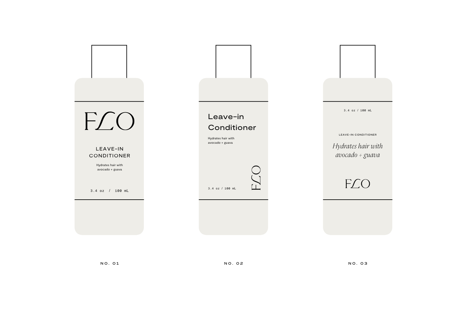
Notice how each of these examples include the exact same information. But the differing treatments of the layout and font sizes/styles cause you to read that same information in a different order. For example no. 01, you notice the logo first, then the product name, then the description. For example no. 02, you notice the product name first, then the logo, then the description. And for example no. 03, you likely notice both the logo and product descriptions equally first, then the product name.
The important question to ask yourself as your begin creating your product packaging is “What information does my ideal customer need to know first about my product? What information will speak more to their buying motivations, spark intrigue or gain their trust?” Approaching your packaging with this mindset will help you design things more strategically and as a result, set your product up to stand out on a shelf.
No. 03 / Be Mindful of the Sea of Same
Even if your product does things differently from everyone else, it’s still important to consider how it might look on a crowded shelf next to lots of other brands. Is everyone else in your industry using the same colors on their packaging? The same type of bottle or box? A similar brand personality or product name? In order to truly stand out, you need to make sure you aren’t following the common trends within your industry. With every packaging decision that you make, ask yourself if that decision is too similar to what someone else has already done. If it is, you may want to go in a different direction that feels more unique to your own brand and values.

To help our own clients avoid this, we do competitor analysis during the first phase of our branding process! We will collect examples of how other brands in their industry have approached their own brand and packaging, making observations about the common trends or themes that seem to be overused. In the image above, you can see some examples that we gathered for a client in the luxury candle space. Some common themes that we noticed here were:
white and black packaging
black borders
all uppercase letters in their logos
color only used to communicate scents
very little illustration or patterns used
From these observations, we were able to better understand how we could use design to make our client stand out among these competitors! By going against some of these common themes, we could to create a brand and packaging experience that would instantly feel different to consumers and better communicate to them what our client’s unique selling points are.
Standing out on a crowded shelf can be difficult, but we hope that this post has helped you find a little extra guidance to be smart and strategic with your product packaging. If you’re currently feeling overwhelmed by the endless packaging decisions you have to make as a founder – we’d love to work with you! You can learn more about our services here or go ahead and inquire to work with us!
And if you’d like some more valuable branding advice, here are some other blog posts to check out:
You Might Also Like


